Responsive Image Analyzer
Are your responsive image settings optimal?
A responsive image includes a list of images at different widths (srcset) and a sizes attribute, that helps the browser decide which one of the srcset images to use.
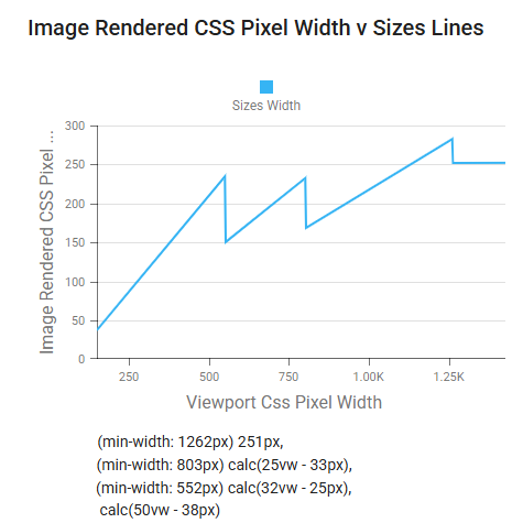
This tool analyses an image on a page as the page's width changes, and determines an optimal srcset and sizes combination.
Provide a URL with a CSS selector to identify the image on the page to analyze. When you click analyze a headless browser will load the URL and then iterate through a set of viewport widths, recording the images display size for each. It will then process the data to determine a sizes attribute that would match how the image changes size, plus a suggested set of image widths to provide in srcset.
It also provides a worst-case scenario when the image is not responsive. And you can provide your own image widths for srcset to compare with the suggested set from the analysis.
The default settings analyse a category page from one of our demo site. It uses data from a US shopping website.